Responsive layout designed for comfortable reading on desktop and mobile.
Content & Service Website
Čas pre dušu
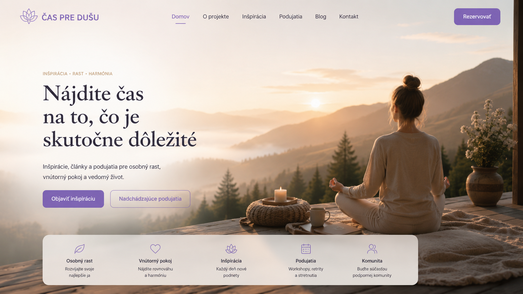
A calm, responsive website focused on clear content hierarchy, approachable presentation and a low-friction path from information to contact or booking.
Next.jsReactTypeScriptCSS ModulesResponsive DesignComponent Architecture
Live link available on request
01 / PROJECT OVERVIEW
What I built
Čas pre dušu is a content- and service-oriented website where the main technical challenge is not application complexity but disciplined frontend execution. The project focuses on readable information architecture, responsive behaviour, reusable UI sections and a visual language that supports the character of the service. It demonstrates that I can adapt implementation and design decisions to the purpose of the product instead of applying the same interface style to every project.
02 / KEY FUNCTIONALITY
What the product does
The features below show the product scope and the kind of business and technical problems handled inside the project.
Reusable content sections and component-based page structure.
Clear hierarchy between informational content, service explanation and calls to action.
Visual styling adapted to a softer content and service brand instead of a generic developer template.
Simple user journey with emphasis on clarity and low-friction contact or booking.
03 / TECHNICAL ARCHITECTURE
How it works technically
A closer look at the decisions behind the frontend, data layer, security and deployment of the application.
Component structure
The page is split into reusable React/Next.js components so content sections can evolve independently without creating one large monolithic page component.
Responsive UI
Layout, spacing and typography are adapted for smaller viewports to keep long-form content readable and preserve clear calls to action across devices.
Styling
CSS Modules keep styles scoped to the relevant components and make the visual system easier to maintain while avoiding global class collisions.
04 / MY RESPONSIBILITY
My role in the project
These are the areas I personally worked on and can discuss in depth during a technical interview.
✓
Translated the purpose of the service into a focused website structure.
✓
Implemented the responsive frontend and reusable visual sections.
✓
Created a component-based structure suitable for future content expansion.
✓
Focused on accessibility of information, readability and clear user actions.
✓
Adapted the design direction to a completely different audience than my technical and business platforms.
05 / ENGINEERING CHALLENGES
Problems I had to solve
The most useful projects are the ones that force real technical decisions. These are examples of those decisions in this project.
Designing around content instead of features
Unlike a dashboard-heavy application, this project succeeds when the interface stays out of the way. The implementation therefore prioritizes hierarchy, typography, spacing and a simple user journey over unnecessary interaction complexity.
Consistent experience on mobile
Long-form content can become tiring on smaller screens. Responsive spacing, section widths and typography are used to keep the experience calm and readable without losing the visual identity of the project.
INTERESTED IN THE IMPLEMENTATION?
Let's talk about the project.
I can walk through the architecture, implementation decisions and the problems solved while building it.